When Brian Chung converted to Christianity, he was excited to read the Bible.
But the book he picked up was dark -- black and purple. The paper was thin and the text tiny.
“For someone that didn’t grow up Christian, it was unlike any other book experience I’d had,” he said.
“For someone that had studied design in college, I thought to myself, ‘How could this be done differently?’”
That curiosity led Chung and Bryan Ye-Chung, his friend and fellow University of Southern California graduate, to create the Bible Beautiful.
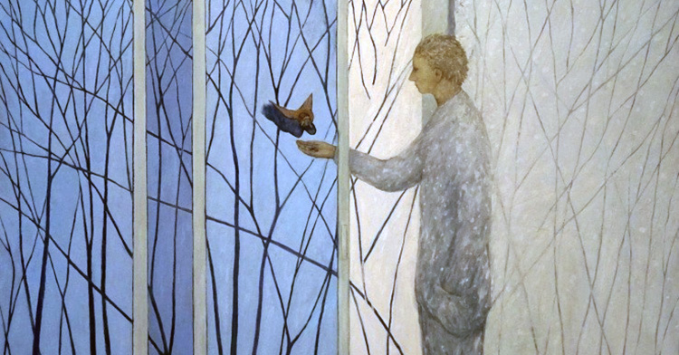
They started with the four Gospels. The volumes are aesthetically stunning, have plenty of white space, millennial-friendly photographs and photo illustrations, and are printed on thick, high-quality paper.
But the Bible Beautiful is more than just a repackaging, they say. This new, modern design of the ancient texts addresses a spiritual question: How can art and beauty connect to faith?
In 2016, the pair launched a Kickstarter campaign that raised nearly $63,000. Two years later, they turned their passion into a business, Alabaster Co. In 2019, Alabaster launched its seventh book, the Book of Proverbs.
Ye-Chung is the company's co-founder and creative director who graduated from the University of Southern California in 2015 with a bachelor's in digital arts and animation. Chung is its co-founder and business director who graduated from USC in 2010 with a degree in business administration. Both were involved with InterVarsity Trojan Christian Fellowship.
Faith & Leadership communications intern Cameron Rogers talked with the co-founders of Alabaster about the Bible Beautiful, their creative process and their hopes for reaching a new audience. The following is an edited transcript.


Faith & Leadership: How has your faith influenced the creation of Alabaster Co. and the Bible Beautiful project?
Bryan Ye-Chung: Brian and I met in college. I was a student studying art and film; I was part of a Christian group on campus.
I would lead Bible studies and then I’d go to the art studio, yet those two parts of my life never really intersected. Toward the end of my senior year, I just became really curious about how to bring those things together.
Around the same time, I started reading this book called “Real Life” by James Choung. In the book, he talks about how each generation will ask a spiritual question that leads them to understand their own spirituality, God or Jesus.
James says the next spiritual question younger generations will be asking is, “What is beautiful?”
I felt like it was just so true. We are increasingly living in a visual culture. For example, everyone has their iPhone with a camera, and we judge websites based on how well they’re designed.
How do we show beauty, and how do we show that the gospel is beautiful? We wanted to make Alabaster address that question, and so you’ll see the answer in a lot of the products.
But really, we’re just trying to have a deeper conversation about the intersection of art, creativity, beauty and faith.
Brian Chung: What makes Alabaster different is the beautiful imagery and structural design of each book of the Bible.
We were thoughtful about the negative space and the photography used to convey the Scripture. I wanted to create a product I would use as someone who didn’t grow up Christian -- a Bible that is a little easier and accessible for me to read.
F&L: Your Bible is designed to appeal to a younger audience. Why was this important?
BC: We were asking, “What is beautiful? What would happen when you connect artistry and faith together?” We didn’t know the answer.
Along the way, we’ve learned and noticed some things. One thing we noticed was how people are using our Bibles; they’re using the Bibles as coffee-table books. Traditionally, Bibles have been placed on the bookshelf.
It’s been interesting for us seeing how a simple design adjustment can change the placement of the book in the home. The Bible is no longer tucked away on the bookshelf but is placed at the center of the home, the center where conversation happens.
Christian leaders today have a real opportunity to think about how they can use our end design to show who God is to the world. Our culture isn’t just asking those questions about what is real, true and good, but also what is beautiful.
Beauty isn’t something to be sidelined but is fundamental in understanding who God is. At Alabaster, our hope is to play a role in helping others understand who God is.
I can see in the future where other Christian leaders are thinking more about beauty, thinking more about art and how it can reveal a deeper and bigger understanding of who God is for the future.
F&L: In the Bible Beautiful, you use the New Living Translation. How does this translation relate to the design?
BYC: We just wanted a more modern translation, and it fits well with the type of products we were creating.
People are just picking it up -- maybe [exploring the Bible] for the first time -- and we wanted a translation that was going to be easy to read but also uphold the integrity of the text. We love the New Living Translation; they have been great partners with us.
F&L: The books have visual themes. In the Book of Romans, for example, I noticed the use of gold hands and gold feet. Why did you focus on gold in your images for Romans?
BYC: Thematically, it was about a church divided, and what was interesting about Romans was trying to capture diversity. There’s diversity in the church, and [we wanted] to find a way to show how diversity could feel united. That is why we used gold.
We were really interested in showing a diversity of people, groups, and being able to paint them all in some form of gold to show we’re all God’s children.
F&L: What is the guiding imagery in the Gospels?
BC: We were trying to highlight things that might be missed when we’re reading the Bible. There is some grammatical structure the modern English reader might not pick up today.
For example, the use of repetition in the Gospels, the repeated themes and repeated words -- those are some things we chose to highlight to let people know this is important.
Back in the day, the Bible was an oral text, and the authors would use repetition as a way to emphasize something to pay attention to. There’s some repetition that leads to a deeper meaning or deeper understanding of Scripture.
In the Book of Mark, there’s the woman with the alabaster flask. She breaks the flask and pours the ointment, or the oil, onto Jesus’ [head]. Immediately after, there is the story of Jesus breaking the bread and pouring out the wine, so there’s this repetition of breaking and pouring we wanted to show.
In the Book of Luke, it was Jesus’ opening statement bringing good news to the poor and the oppressed. Throughout the Alabaster passages, we highlighted where Jesus was acting for the poor, marginalized and oppressed.
F&L: Changing the traditional biblical imagery is a big challenge. What were some concerns?
BC: What was really important for me, as someone that teaches the Bible, was to have integrity with the text.
Before every study, we’d do a deep dive on a passage. We would look at every different commentary on each of the books. We contacted a lot of our friends who studied at seminaries so they could give us their advisory feedback.
While we looked at church history, we were really inspired by the Renaissance artists and painters, people who made those beautiful cathedrals and the stained-glass windows.
The artists who have painted these beautiful pieces of art ultimately pointed people to God. The idea of carrying Scripture next to art isn’t a new idea; in fact, it’s already happening. We just wanted to do the same thing in the print form.
The Bible Beautiful wasn’t meant to replace people’s typical Bibles but more to help people go deeper with interweaving the Scriptures alongside art.
F&L: Why did you name your company Alabaster?
BYC: The name was the first thing we came up with. It’s named after a passage in Mark chapter 14 -- the story of the woman who breaks the alabaster jar.
The jar is [likely] meant to be a dowry, so it’s really expensive -- worth maybe a year’s wages -- and everyone in the room is scoffing at the woman: “Why did you do that? It’s such a waste.”
Jesus defends her and says, “Leave her alone; why do you bother her? What she has done is a beautiful thing.”
Brian and I were really captivated by that passage, because … Jesus uses the word “beautiful” -- kalos, I believe, in the original Greek.
Our whole ethos of the brand is to explore the beauty, so we really wanted to model our company after a passage representing beauty.
BC: I remember when I first became a Christian and looked at some other pieces of art made by Christians, and sometimes they felt a little cheesy.
In 2017, I was looking at Christian T-shirts, and there was a T-shirt that had the old Myspace logo and it said, “God save myspace in heaven.” I doubted it was something I would wear.
Things have changed since then, but as creative artists, it was important for us to create an excellent product Christians and non-Christians would use.
The feedback we’ve been hearing from Christians is that it has helped them deepen their experience with God. It’s helped them get deeper in the Scripture, actually start reading the Bible.
I have a friend who isn’t religious and feels comfortable to read this Bible versus the typical Bible. We see this as a product more accessible for people who aren’t Christian.
F&L: Are you working on more books? What’s in the future for Alabaster?
BYC: There are 66 books in the Bible. We are taking it book by book. The next book we’re going to be doing is Genesis, and it should be launching later this year. We’ve been working on it for a couple of months now, and it’s exciting.